
Vertebrae Social
The Opportunity
I was approached by Samantha Wiltshire to help design a brand for her new venture Vertebrae Social a personal branding agency with a difference. Sam has run a successful social media and digital marketing agency for over 4 years but most recently wanted to take a fresh approach with their offer and create a new brand which better reflected their personality and unique approach to personal branding and community building. They wanted the new brand to be direct, impactful, more subversive and reference their passions, giving me vintage skate stickers and eighties hardcore punk posters as references.


The Identity
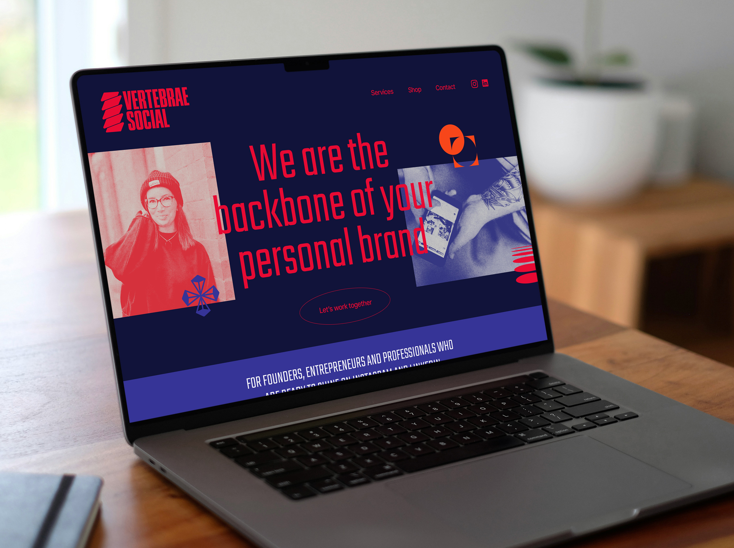
The creative concept for Vertebrae Social helps to bring to life Sam’s vision for a branding agency with a difference, one that subverts the usual look and feel / tone of voice of the average social media content creator, and instead makes a bold statement in order to stand out from the crowd.
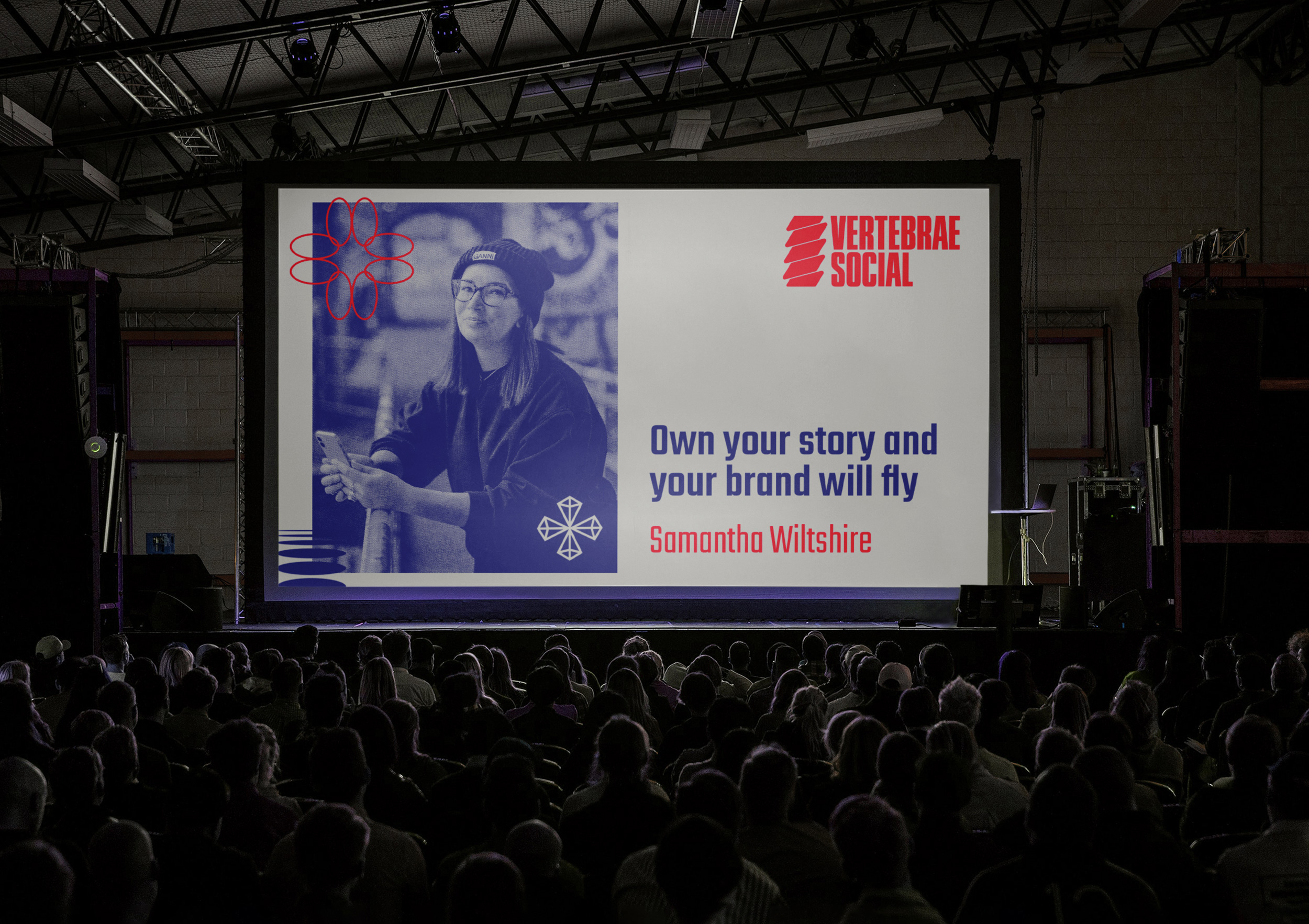
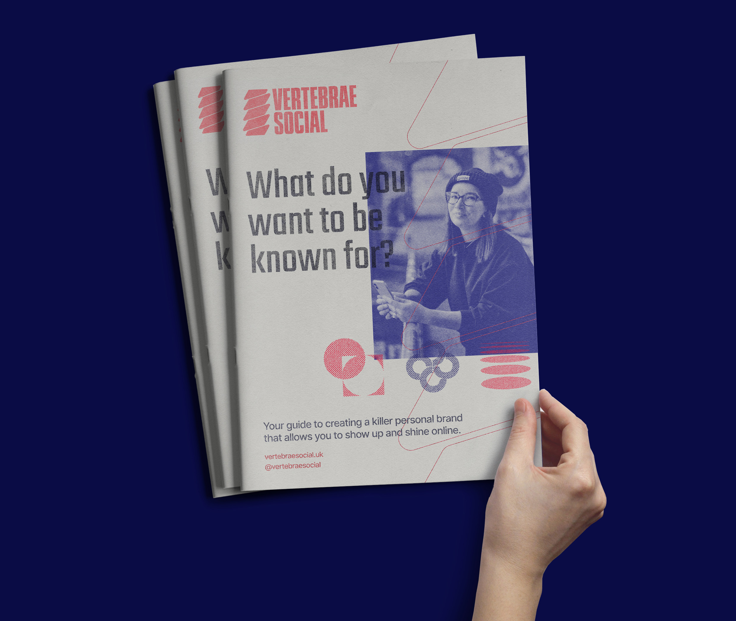
Inspired by their mission to bring lesser heard voices to the forefront, the creative feels fearless and confident starting with a logo which features a unique graphic backbone mark paired with assured, contemporary typography.

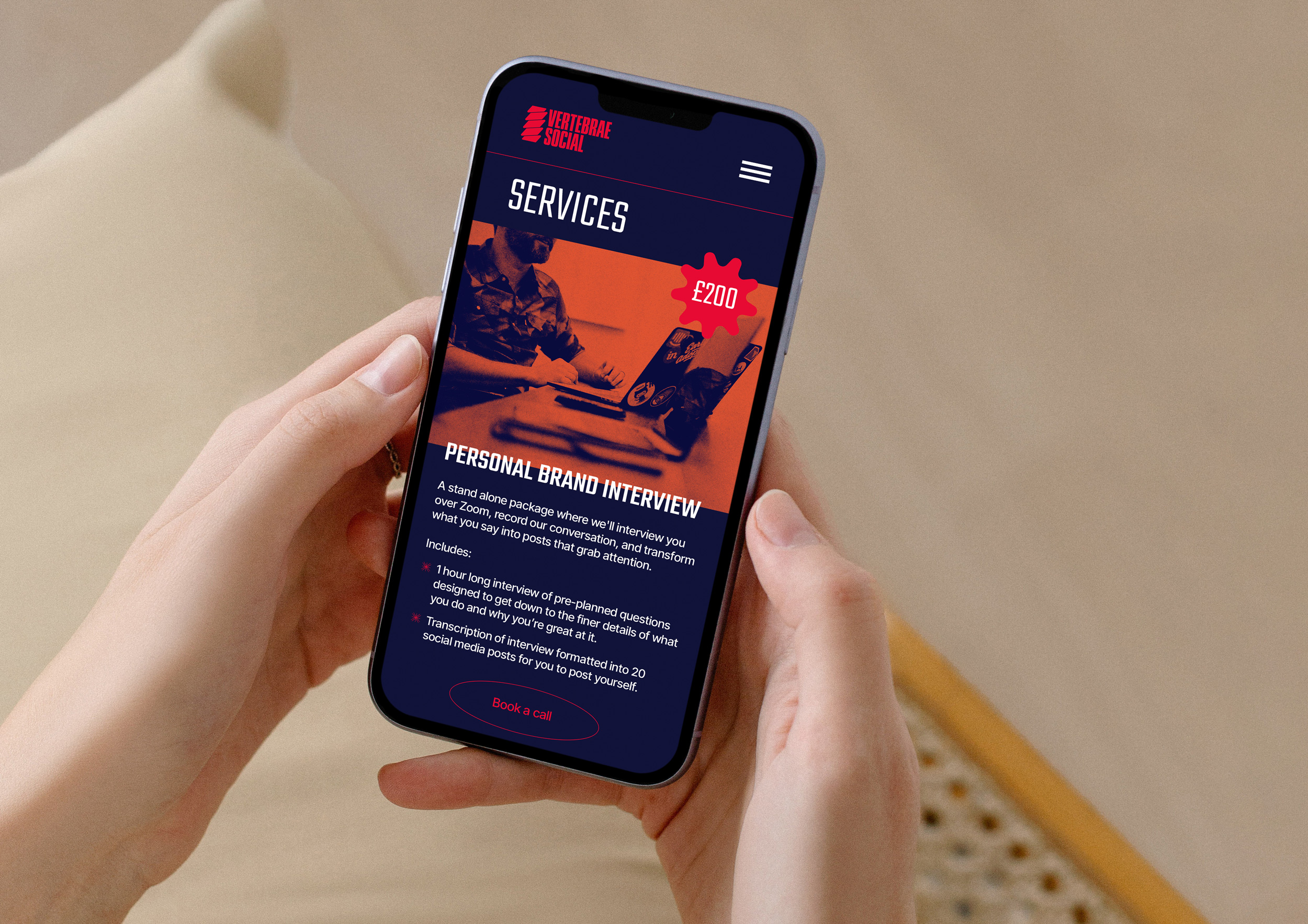
The colour palette feels impactful with deep warm blues, vivid reds and bright pops of orange. The overall feel is inkeeping with the agency’s digital/tech background, but also references their wider cultural music and art influences.
Thought was also given to how photography would be presented – a halftone textured feel is used along with a duotone effect from the colour palette. The result is a punk inspired, un-glossy feel which works well digitally but would also translate perfectly into risograph printed material.

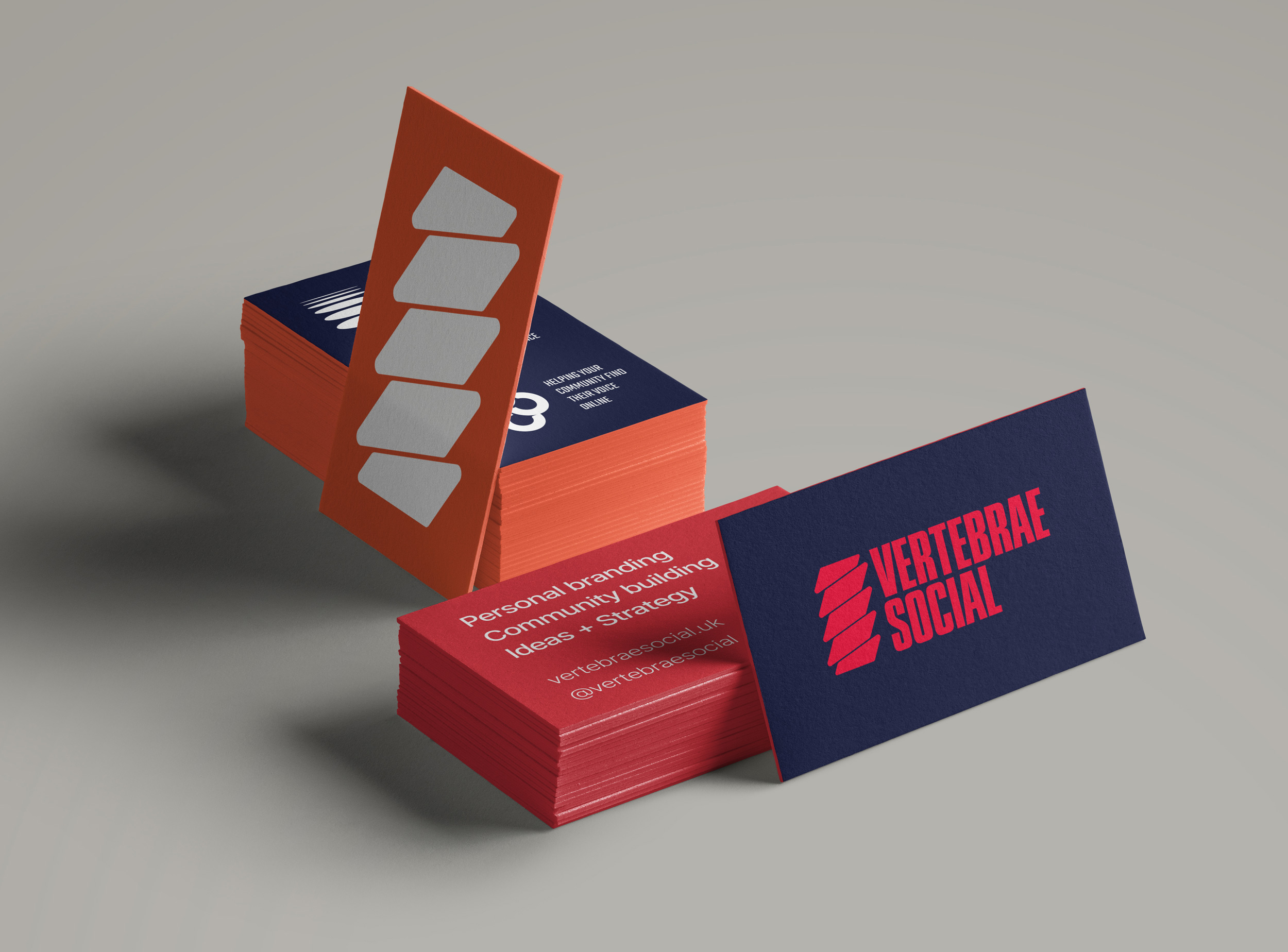
I developed a suite of icons which represent Vertebrae Social’s 3 main strands of work; Personal Branding, Community Building and Ideas + Strategy. These icons bring variety and interest across the suite of comms material and social media assets, either used individually or by creating bespoke patterns.
Typography choices for the brand followed the logo in their contemporary and clean feel, with two sans serif typefaces for headlines and body copy, and a characterful brush typeface for more conversational copy to help bring Sam’s unique tone of voice to life.


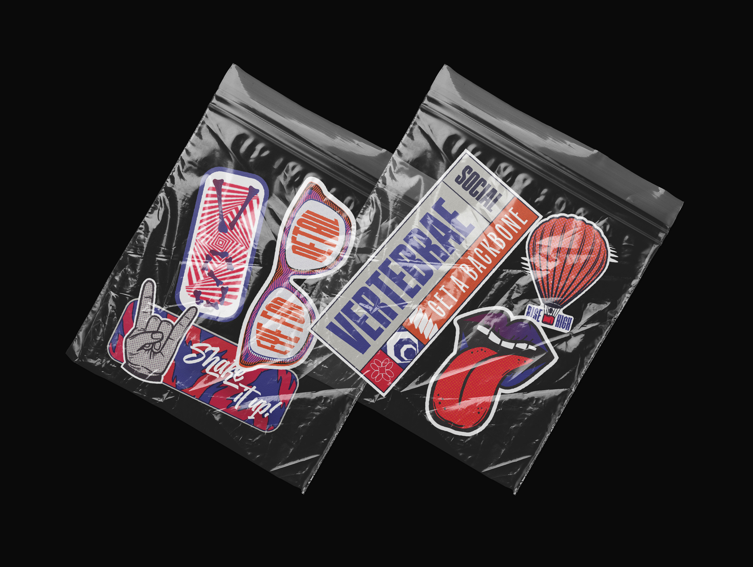
I designed a set of stickers inspired by the punk/skate aesthetic which offer a more informal way for Vertebrae Social to communicate their quirky and direct messaging, both for use digitally and to be made into a printed sticker set. The imagery is rooted in the team’s interests and personalities and is paired with direct and punchy slogans.
This fresh approach to a truly unique brand plays out across multiple touchpoints, challenging the status quo whilst remaining playful, savvy and experienced.
Lindsay is incredible at what she does. She took my chaotic references and ideas, understood them and refined my brand into something that feels intrinsically me but also works commercially. She listens, suggests ideas and thinks about the bigger picture going forward so you have assets that work online and in real life too.
Sam Wiltshire, Vertebrae Social