King Edward VI College, Stourbridge
King Edward VI College Stourbridge were looking to develop a refreshed brand identity which communicates the college’s well established tradition, heritage and top performing status, whilst portraying the college as a vibrant, welcoming and inclusive establishment. The brand work aimed to help to form a foundation to assist the College in diversifying its income streams and appeal to different markets.
This project took a holistic approach to understanding the challenges and opportunities for the brand. After initial research into the College’s current status along with that of its peers in the education sector, a need was identified to open the conversation to key stakeholders to gain a real insight into the potential of the brand and how it needed to adapt.
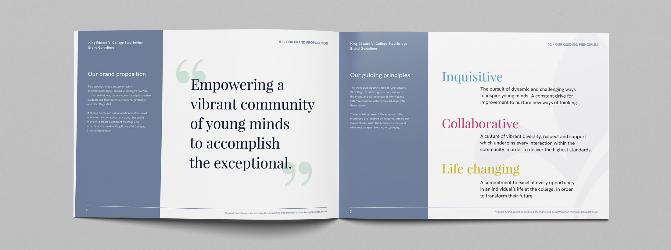
I led a number of informal brand workshops and interviews at the College with students, teachers, staff and parents which highlighted what really mattered to each stakeholder. Through careful analysis of these results and working closely with the King Ed’s team, I defined a new brand proposition and created a set of guiding principles representing the essence of the brand.
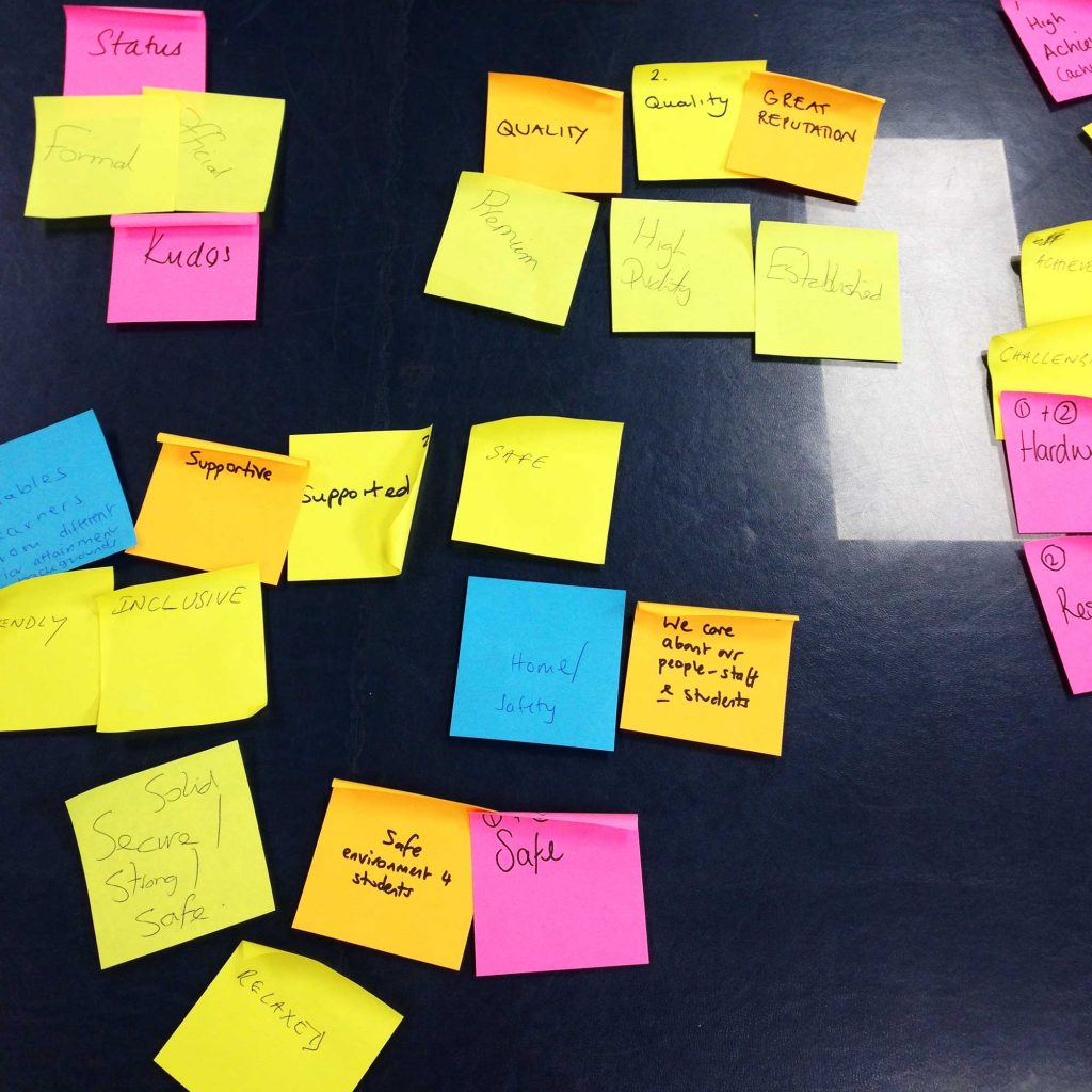
A set of brand expressions were then created which bring the brand proposition to life and aim to establish the College’s leading position within the local community. These could be used by the internal marketing team to drive campaigns and to create an emotive message to specific target audiences.
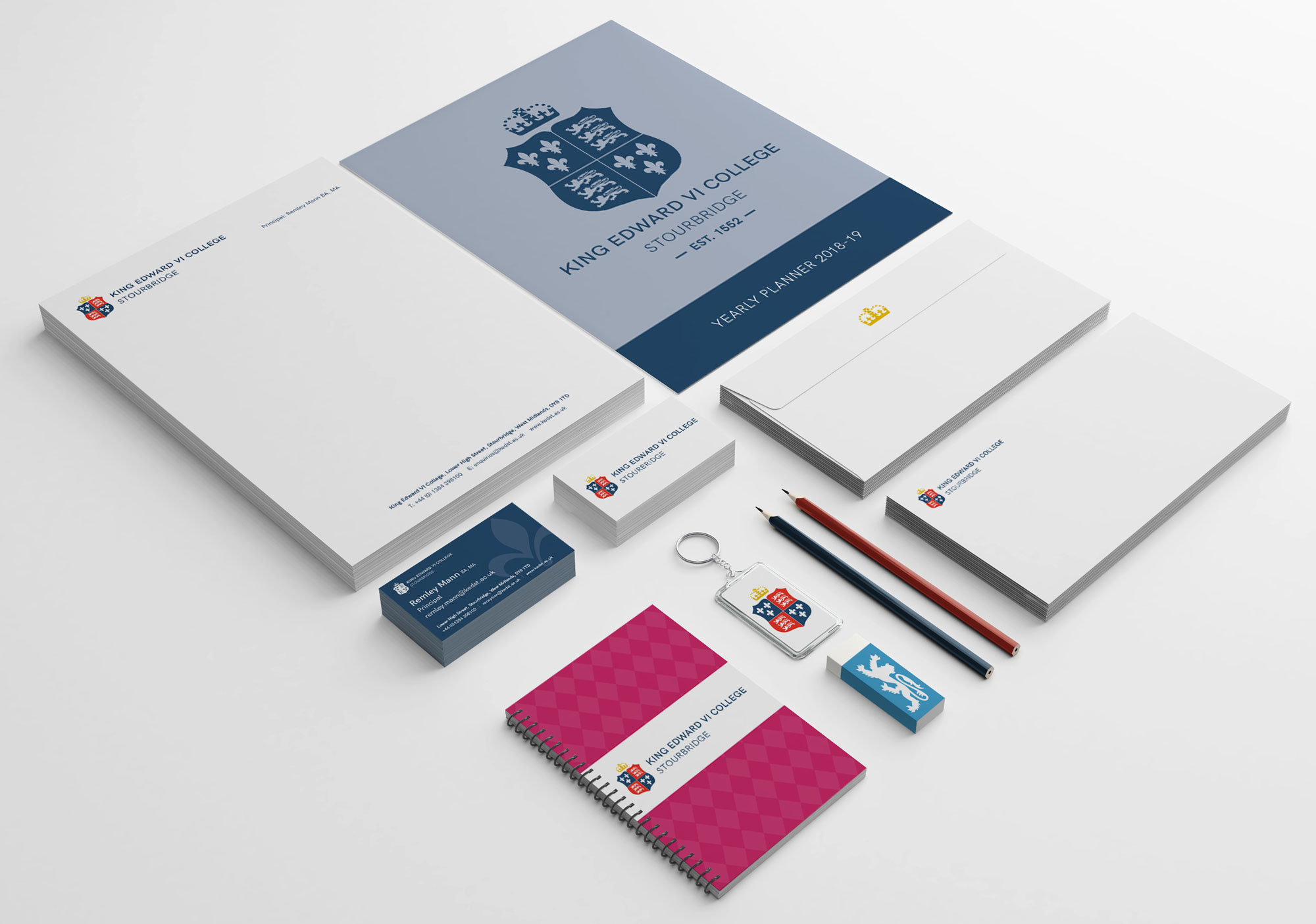
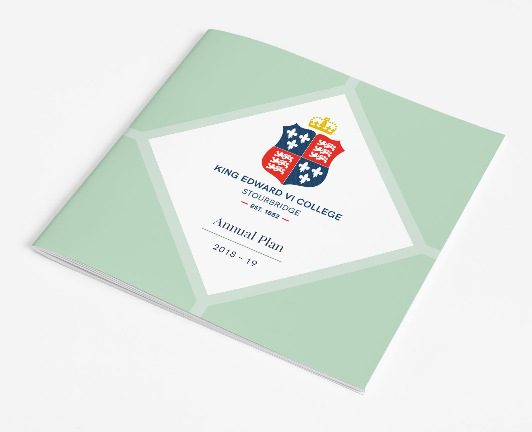
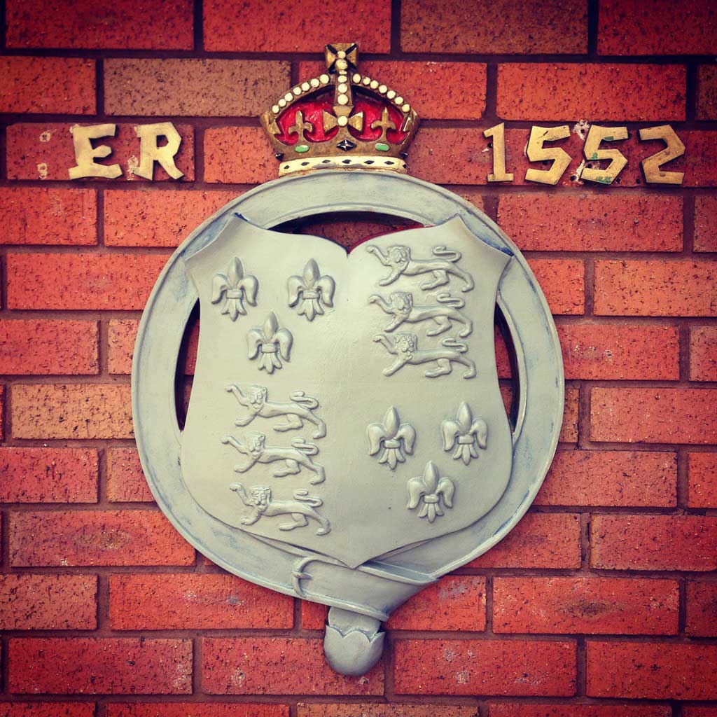
Building on the brand strategy work, I then approached the redesign of the well established logo. Design concepts had to be respectful of the existing crest and I also wanted to develop an accompanying visual language which would create a wider graphic identity for the brand.
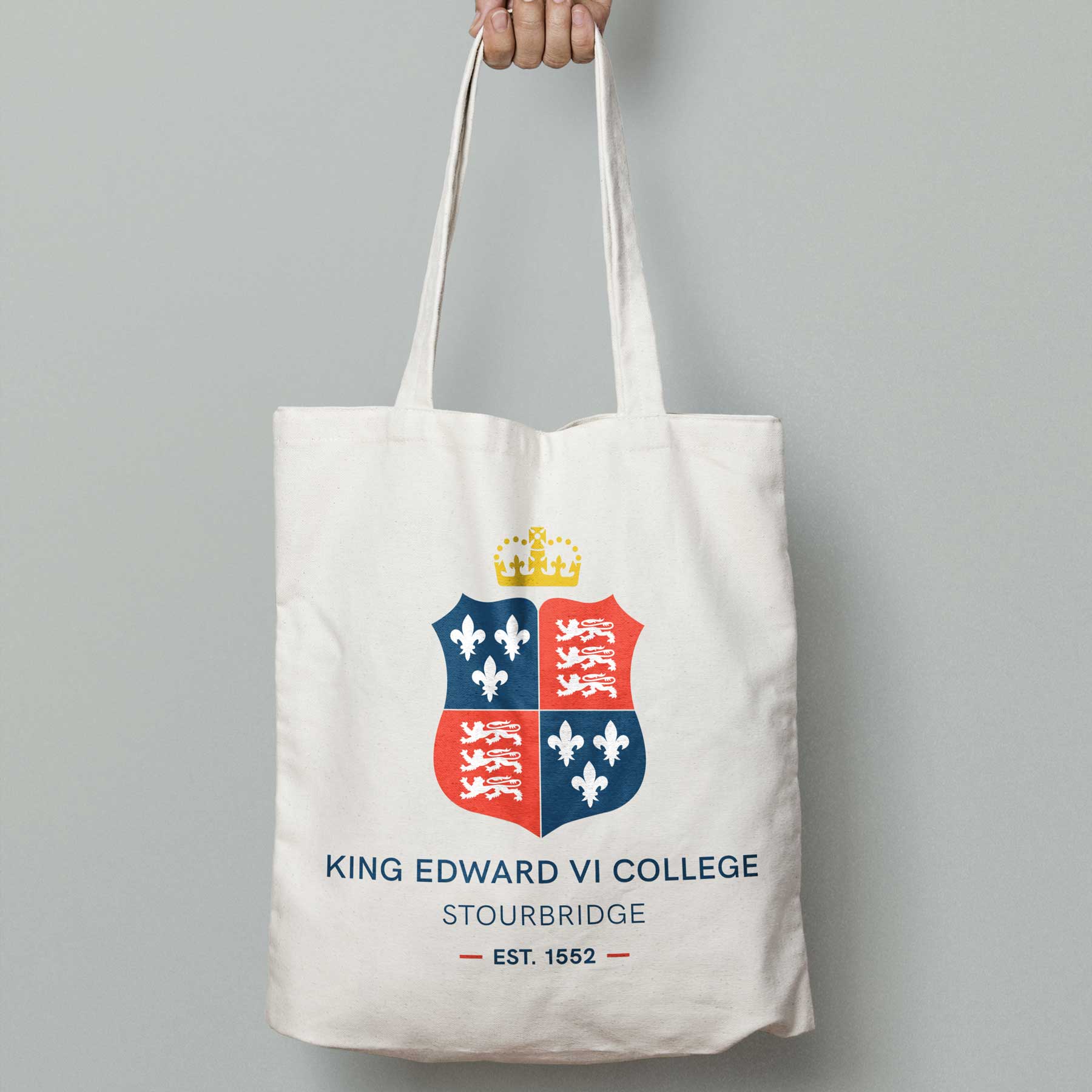
The new identity revitalises the crest to create a new, welcoming, modern and confident identity for the College. Greater simplicity and clarity was also a priority, particularly online where the existing logo did not reproduce clearly at smaller sizes on mobile devices.
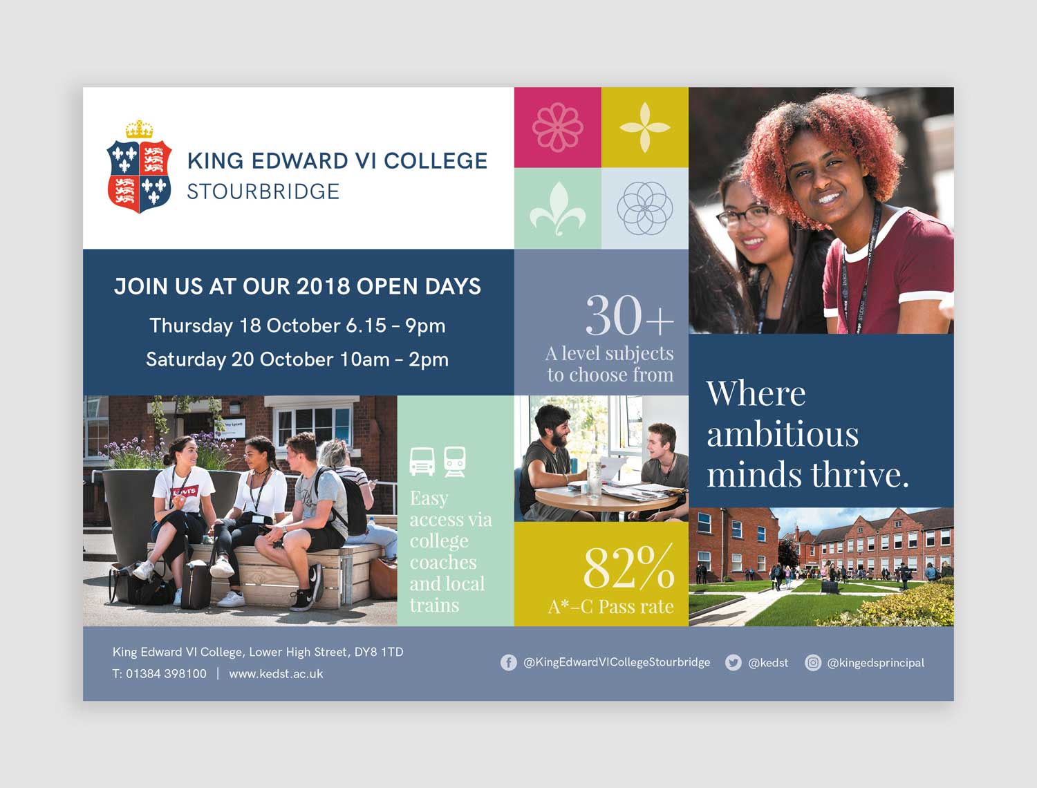
Drawing on unique architectural features of the building, I developed a unique colour palette and set of icons which help bring the brand collateral to life.
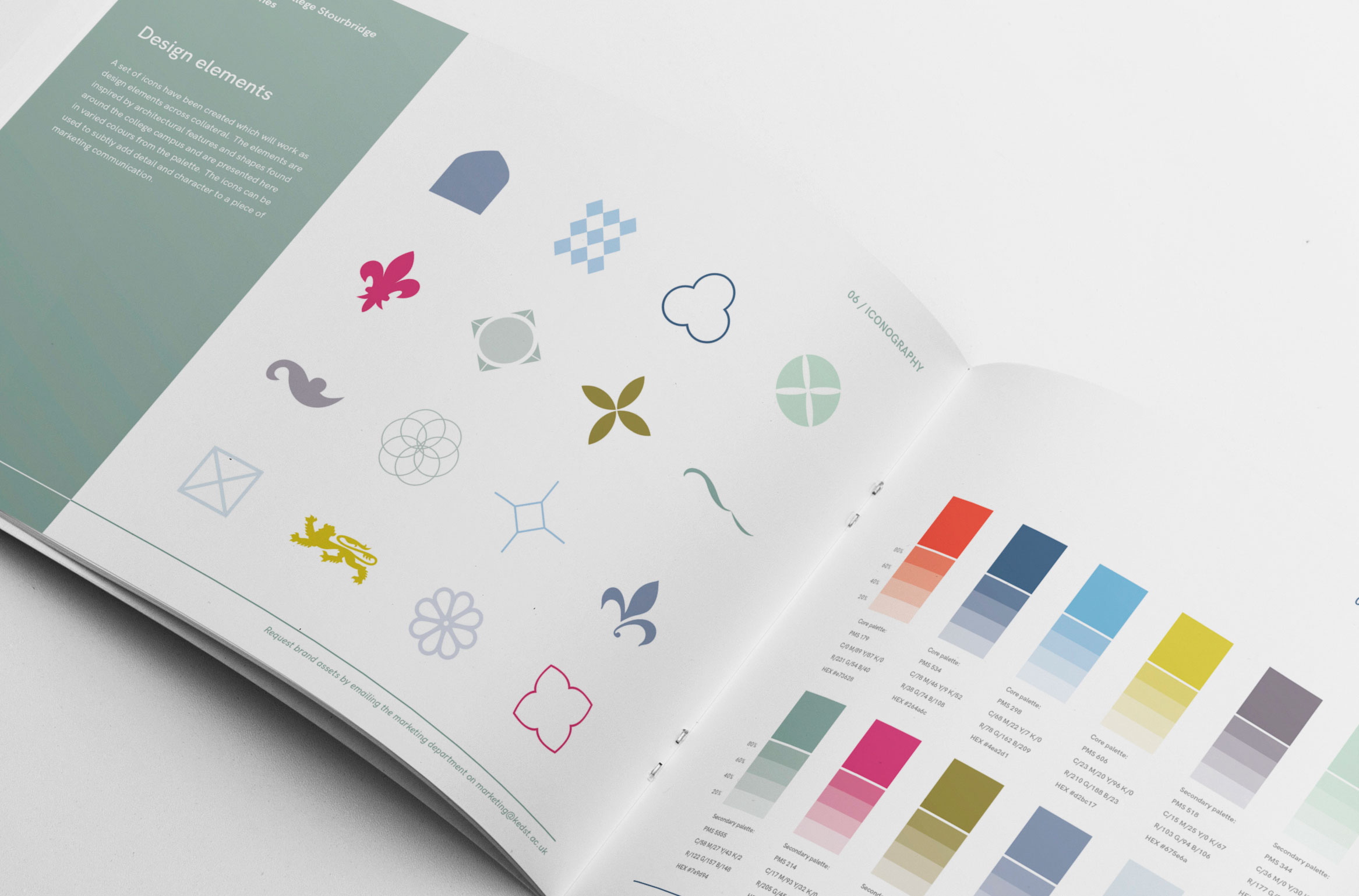
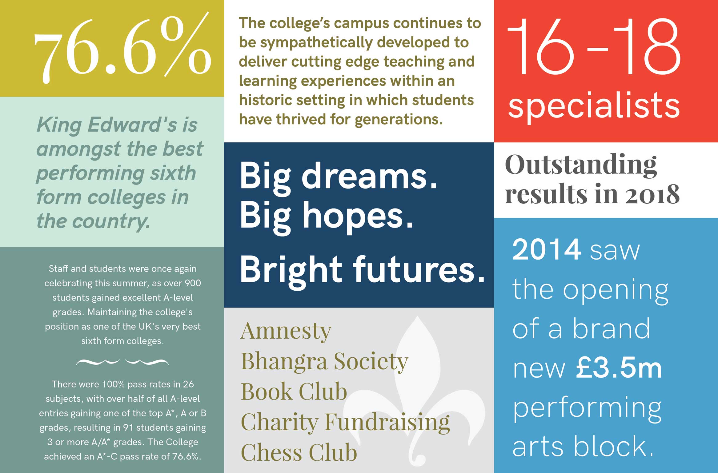
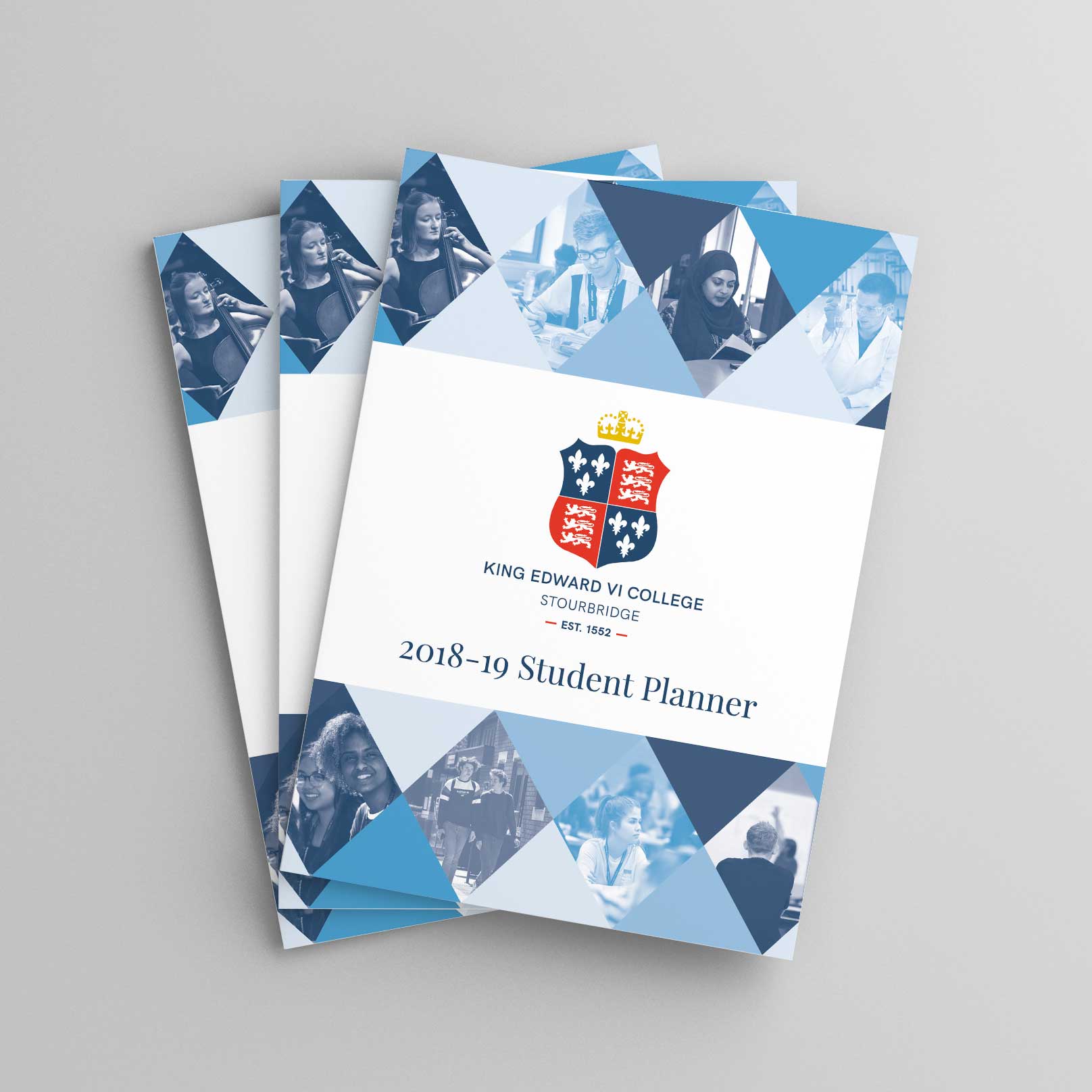
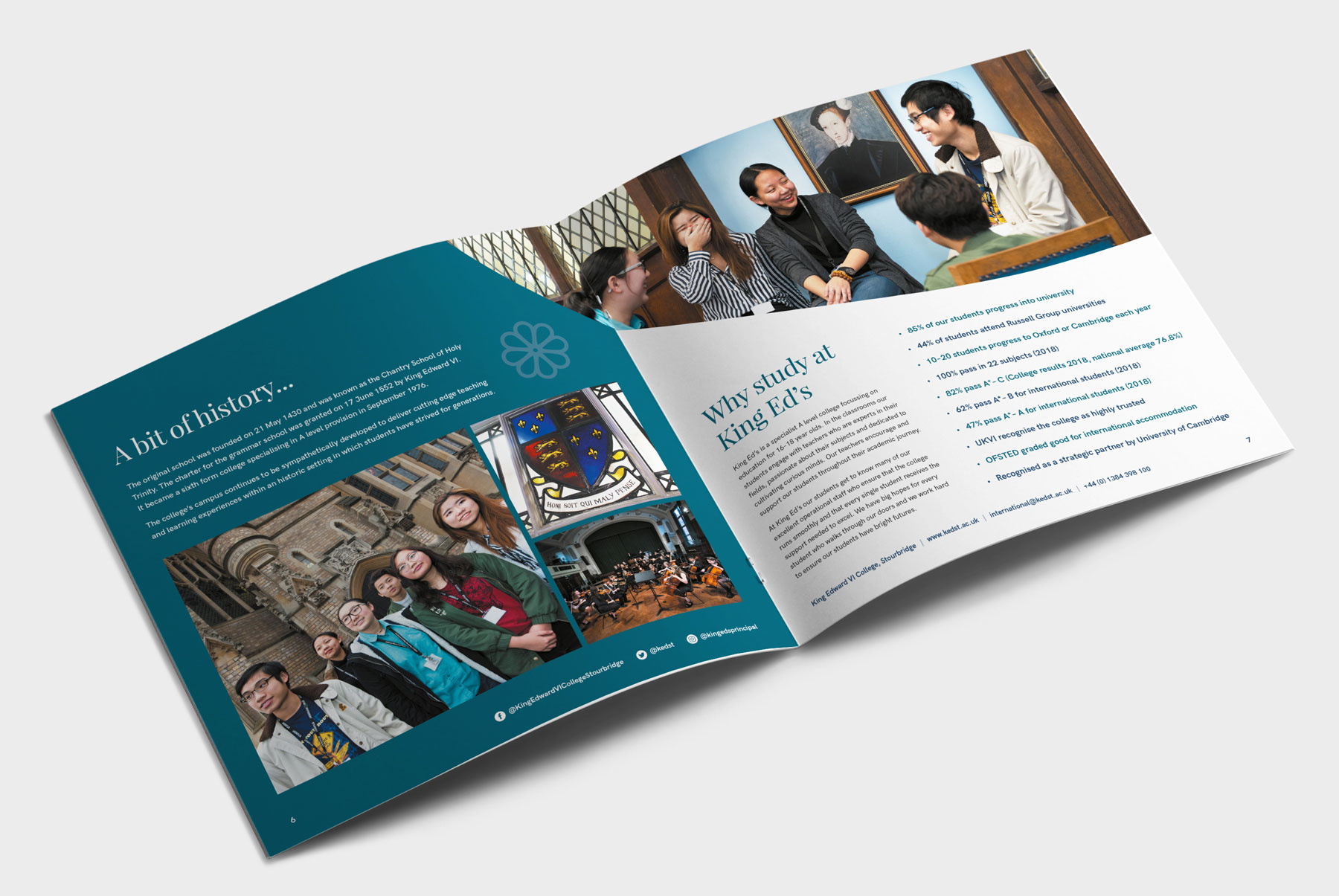
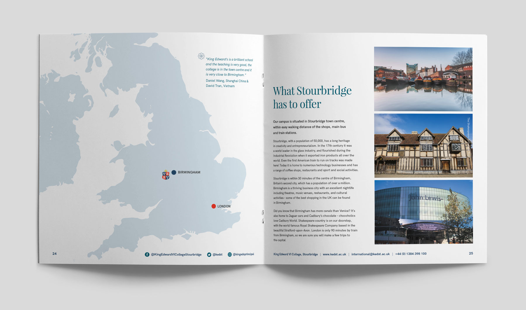
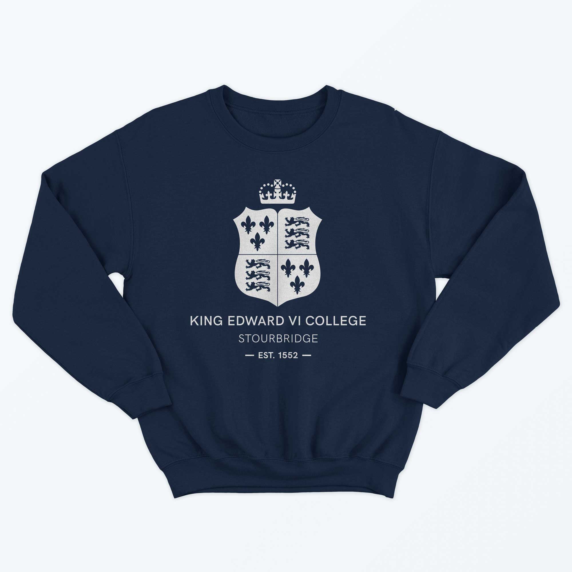
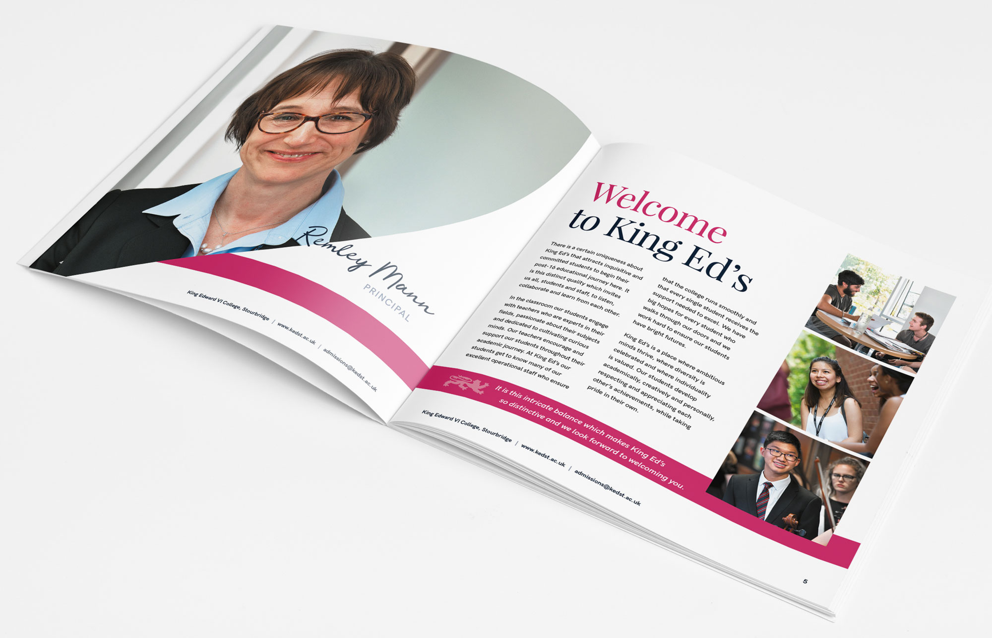
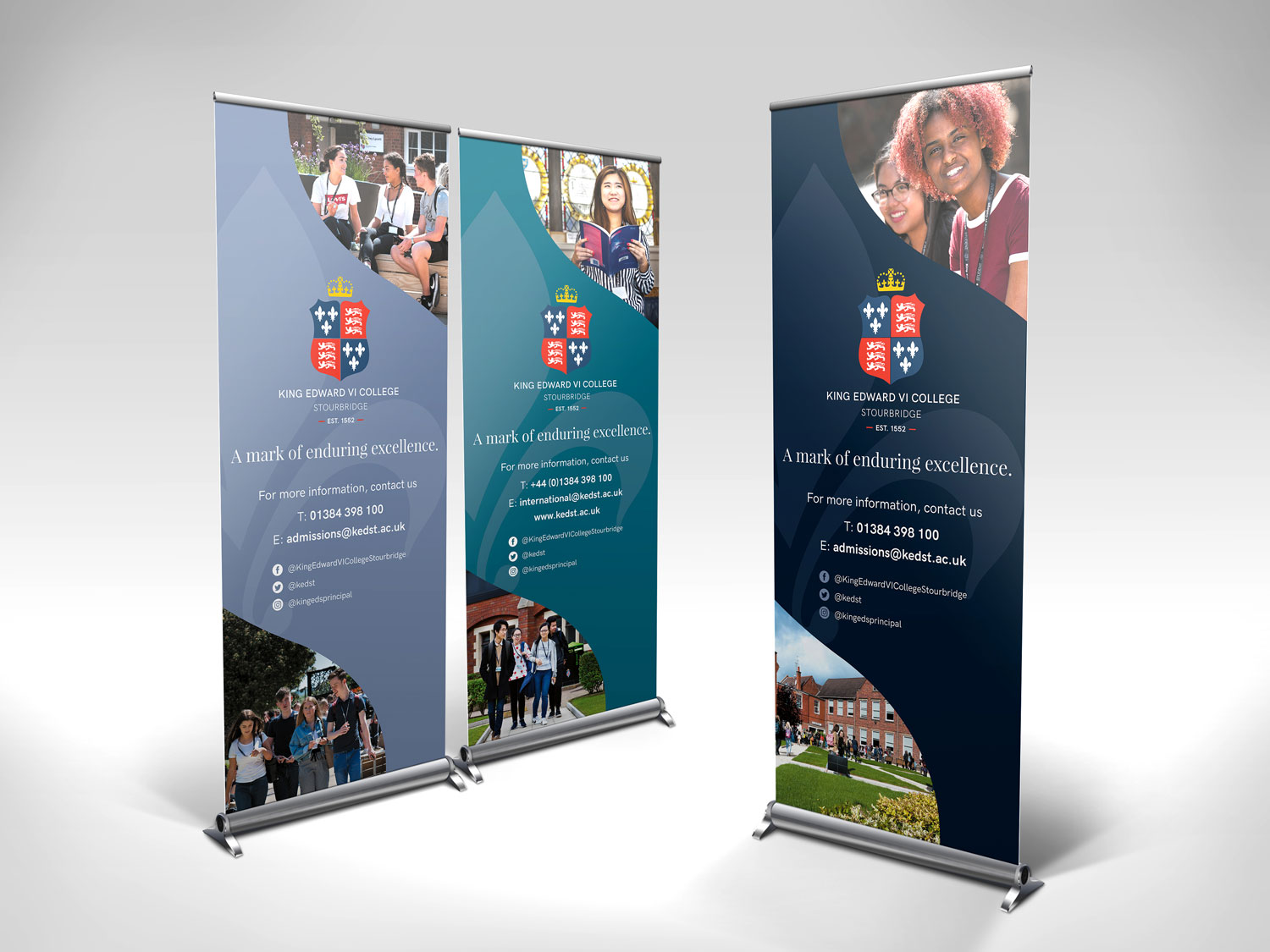
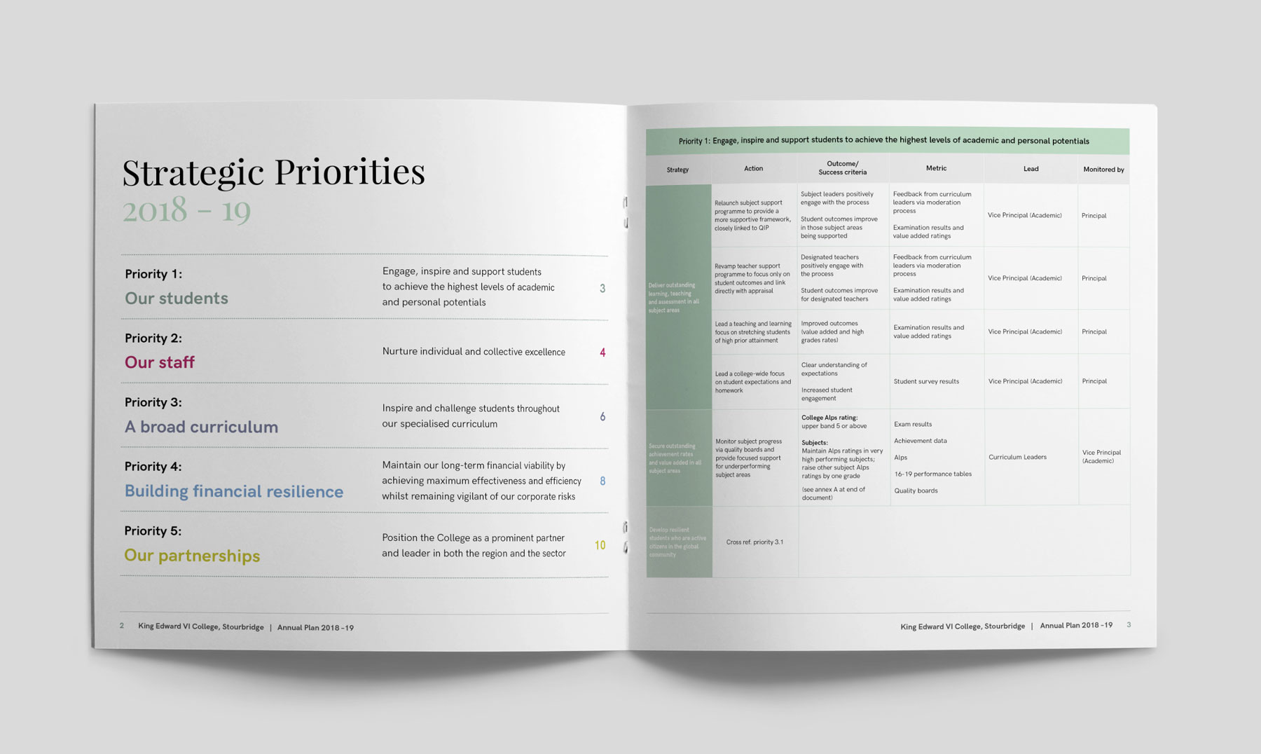
Applications of the brand so far have included prospectus designs for different areas of the College’s offering, refreshed stationery, merchandise including enamel badges, sweatshirts and totebags, pull up stands, advertisements and print collateral for targeted publicity campaigns and internal signage.
We have been working with Lindsay to develop a fresh identity for the college. It was a hard brief as we are steeped in tradition and we didn’t want to lose that but needed an identity which was more approachable and would allow us to engage with a younger audience. After conducting brand workshops with different groups within the college and disseminating all the information gained we were delighted with the output. The roll out is underway with the delivery of a beautiful prospectus and other collateral and we feel we now have a firm foundation which we can build upon and very much see Lindsay as part of our extended team.
Ruth Taylor, Admissions & Marketing
